Thursday, December 12, 2019

Children's book sample Illustration

Currently I'm engaged in several book illustration projects, as well as some corporate client projects, (including one ongoing gig detailed here earlier).

I thought I would stop by to share a page from a children's book that I'm working on in my spare time...("Page 3" to be exact - which means little to you at this point.)

                                                          (Clicken to embiggen..)


Monday, September 23, 2019

On the Digital Drawing Board: Writing funny - for cartoons

I wrote about my drawing process in "step-by-step" manner a few months ago, and that post received a good response, so I thought I'd try another. 
 
This one is involves writing, for an ongoing project for Ralph Lauren Polo Inc., that started a few months ago. 

RL's Director of advertising contacted me in June, to discuss doing a series of humorous cartoon illustrations, focusing on their Polo-inspired restaurants. (I was aware of the restaurant in New York City, but learned there are also "Polo" establishments in Paris, London and Chicago.)


"The Polo Bar" in New York


  Their advertising director told me that the Polo restaurant in NYC is frequented by celebrities, and their goal was to highlight that fact with humor...i.e., depicting some of these well known humans, and to write funny concepts that fit their personalities. Both were right up my alley.


Robert De Niro and Al Pacino, dining in the Polo Bar earlier this week.
(They were in NYC promoting the Martin Scorcese film, "The Irishman".)

(Photos from an article provided to me by RL for background; covering the Duchess of Sussex/former 'Suits' actress, dining there earlier this year -.)

---------------

An added challenge arose: RL's execs felt that I should write and draw concepts only for deceased celebrities. (I get it...and deal with this dynamic often with political and social commentary cartoons. The living are much easier to offend.) 
 
However, that is a significant restriction, especially when trying to create content that will resonate with today's social media savvy audiences...more on that later in the post.

Another caveat: Ralph Lauren's upper management wanted me to write humor in my own style and  'voice', but wondered if I could aim my celebrity caricatures in a direction toward the style of the late, great caricaturist, Al Hirschfeld. (Al is widely considered to be the greatest caricaturist of all time, and his flowing ink lines were mesmerizing. During his heyday, he was fixture in NYC and was known for drawing celebrities - hence the tie-in to the NYC Polo Bar.)

Al Hirschfeld Limited Editions and Originals

There are challenges in trying to emulate someone else's work, especially that of a legend. For one thing, it is difficult to nail such a distinctive, well-honed (and frankly, brilliant) style. Then there's the issue of drawing in another person's style while also getting good likenesses of the aforementioned celebrities. Every caricaturist's method of finding the "right" likeness is different, and I had to combine his drawing style with my own sensibilities about how to depict a person, and what to exaggerate. Of course such a challenge can be fun, and this proved to be true.

Here's the process outline for the first cartoon, which was a test, or proof of concept for RL - to see if we could make this "work":
----------------

Step 1: I sat in the comfy "writing chair" in my studio and brainstormed a bit. (I find that for me, writing is best suited to the quiet of the morning, before activities of the day march forth, including client calls/emails.) After noting some seeds of ideas, I wrote out around ten concepts on a notepad. These were all done with some piece of humor present, but the specifics were very rough. 

Step 2: Editing ideas and sharpening humor: Afterward, I selected what I thought had the potential to be the funniest four concepts, fleshed them out a bit. 
 
These were all written out, using only words and phrasing to get across the concept, without images and sketches. I've found that a funny written idea will stand on its own. After such an idea is identified, funny art can really enhance it. But weak ideas and unfunny concepts are almost never brought to life with even the most badass funny drawings.

I finished writing and editing, and emailed those four concepts to RL's corporate folks in New York. 

Surprisingly, they liked all four ideas, (that does not usually happen, at least for relevance reasons), and they approved starting the artwork on two immediately.

Step 3: I began the first art with a sketched concept featuring Elvis and Marilyn Monroe...


Step 5: The sketch was passed around their management and with a positive response, I went forward with finished artwork in "ink" on my Wacom Cintiq.


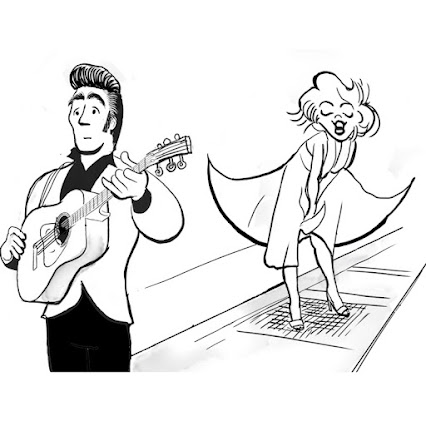
  Elvis and Marilyn  Monroe were the two elements that I felt were the strongest, so I refined those, and then built the cartoon around them.


Step 6: I added or "spotted" areas of black ink for contrast and to lead the viewers' eyes to Marilyn. The text was simplified and shading was rendered.

The cartoons are appearing in RL's various social media, for example, their  Instagram.


Later, I simplified the scene, and added some splashes of watercolor
 for further social media and print ads:


-----------------

On this second cartoon, an abbreviated glimpse of the process. I went with a Polo theme concept and a young Paul Newman, Clark Gable and Marlon Brando. 


-----------------

...But later I decided that it might be fun to have some continuity between cartoons, so I switched Clark Gable for the King. He finally gets a table - as he should. (Paul Newman is also at the table)


I made other changes: Redrawing the woman in the left foreground, (giving her less contrast, so as to not draw the reader's eye away from the action. The folks at RL also asked me make her a bit more attractive. I added contrast to the area behind the men. Lastly, I added the RL Polo Bar logo to a window on the right.

-------------


We have done four cartoons so far, with two of them released. Both have received a positive response in their various ads and social media platforms, and RL's management decided to go forward with more. I have enjoyed the challenge and scope of this project so far, (pleasing the client, the main goal for me) and we'll see how it goes over the next several months. 

One thing is nearly certain...I think that I will soon run out of deceased celebrities who are recognizable to today's audiences, and that I will need to talk the RL folks into allowing me to draw and write about some people with a pulse. 


Friday, September 20, 2019

Step by Step Illustration

Most illustrators and cartoonists with blogs post regular samples or "round ups"  of their recent work. (Actually, this is also done by most writers, photographers, painters, loan sharks, etc..)

These posts keep clients and colleagues up to date...and they also serve as great marketing tools. For visual artists, there's an additional benefit: people doing Google image searches for (cartoons, photos, art) click their way to the images in these blog posts, and some become new clients. I'm not enough a marketer to post for that reason alone, but I've read about it, and have seen that it works.

But I'll tell you, doing "What I've been up to lately" posts can be a snooze fest.

I feel similar sleepiness doing the social media marketing that nearly all businesses use now. (It also feels a little too self-involved at times.) But as one of my longtime clients (social media marketing pioneer,  Hubspot) proclaims, "inbound marketing" is essential today.


Buy this cartoon


Due to to my disenchantment with that kind of blogging, this journal has gone from weekly, to biweekly, to monthly, to quarterly, to biannually...and it's now creeping up on annually. That is fine, because I have more free time, and my drawing board has been steadily busy with clients without it.

But rather than to announce the death of this blog. ..or to make another post filled with (in my estimation) boring Whitman's sampler boxes of 15-20 recent client projects, I've decided to do something else.

After surfacing here the other day, (my first post in 9 months) I realized that some of the more popular posts here, (based on view counters) involved sharing the creative process.

No, I don't think there's a large group of people out there clamoring with wonderment about this stuff, ("Tell us, Mark...how does the fun in your cartoons get unleashed?")

But based on views and comments, there appears to be curiosity. So for those folks, here we go:

----------------

This project was on my drawing board a few weeks ago. It's unlike most of the work I post here, as it is a personal commission or gift...something I typically do about once each month.

What makes it different than most of my client work, is that it is not published or featured online. It is only seen by that individual and whomever happens to see it hanging in that person's office or study (or garage?) wall.  A relatively small audience.

The client was global utility sector leader, Capgemini. I was surprised to learn that the Paris-based company has over 300,000 employees, but I'm embarrassed to admit that until they contacted me, I had never heard of them. (Unless you live in France or Canada, I'm betting you haven't either.)

They celebrated the retirement of one of their executives recently, and they wanted to create a gift to present to him at a party - a custom drawn humorous illustration depicting key milestones during his career. One of their Vice Presidents contacted me and, after a brief interview with him - an exceedingly nice guy - they hired me to do it.

Step 1: After discussing what they had in mind, and learning about the retiring executive's career, I requested several reference photos to help in creating a good likeness.

When drawing someone I have never met or whom is not a famous public figure, it is crucial to see front and profile photos with a range of emotions.


Step 2: I worked on the concept for the layout with another executive of Capgemini...someone who had worked with the gentleman to be honored. I was given a list of his achievements and set about illustrating them in a lighthearted and humorous manner.


Step 3: The concept and layout. I discussed two theme ideas with Capgemini: A series of small comic panels depicting milestones of the gentleman's career. I thought this sounded workable, but not really visually interesting, especially for something to be presented at a large group gathering. It needed more visual punch. So, I suggested a caricature drawing/painting of this gentleman surrounded by smaller vignettes. They liked that idea.


Step 4: The sketch.


Step 5: After discussing the sketch, some minor revisions were made, and a few more scenes were added.


Step 6 I formatted the artwork at 11 x 17, which is a nice standard size for printing - and for easy  framing. Color was added in the form of digital watercolor washes. The art was drawn/painted on a Wacom Cintiq drawing screen. (photos below)


Wacom CINTIQ 22HD Review | Warrick Wong Design


Step 7: I emailed a high resolution CMYK (publishing industry standard 4-color process) file, which the client had printed locally and then matted and framed.


                                                                   (Click to enlarge).


I still occasionally print and ship artwork, but with tight deadlines, is it more expedient and more efficient to email these to clients.


A photo taken at the celebration in Toronto: The gentleman with his executive assistant, and another Capgemini Vice President (with whom I worked on the piece).


------------------

Commissioned Illustration #2


I thought I'd share another similar gift commission, to show a slightly different process. (This was created two weeks ago, for a financial industry client in New York whom I first worked with over ten years ago.)

This piece involved depicting the director of another NY financial advising firm who easing his way into retirement. The client's idea was to create a two-paneled illustration...also showing the subject's long time assistant, who will assuming his position. This became a bit of a fun challenge.

I was asked to illustrate the first subject playing guitar while seated on his motorcycle at his desk. (i.e. not really working very hard anymore.)

Meanwhile, on the other side illustration is the new director of the firm...and she was to be shown as clearly very busy after taking the reins.

Step 1: the sketch was a layout of that theme, along with caricatures based upon a photo of each person.


As I mentioned above, having more than one or two photos is very helpful. And as it turns out, in this case, I did not 'capture' the woman's  likeness very well. I wondered about that, as I was told that we only had one photo use, and it was several years old.

Step 2: I tried to revise the drawing, (aging her slightly) based upon comments, but it really wasn't close enough.
Finally, the client was able to find additional images, in the form of a video. So I was able see her as she looks now, from several angles, which is almost as good as meeting her. It helped a great deal.

Step 3: A revised sketch below:
Since I had already gotten good likeness of Kevin, the man on the left earlier,
 I took the liberty of adding color to that part of the cartoon.


Step 4: The client liked the layout and the new drawing, so I applied a 
watercolor wash over everything else in the illustration.


clicken to embiggen


Read more

Monday, September 16, 2019

Summer in the rear view mirror


It has been many moons since I spend any time on the blog. As I mentioned in my last post (nine months ago), I have been spending more time with my work and family it's working out pretty well.

A few trips in recent months, including a trip to see my Mom for her birthday, two visits to Nashville Tennessee, as well as an excursion to Alaska.

Well, I'm somewhat embarrassed to say that I have gotten into a nice groove of not posting on my blog, so to break that streak I'll just share some glimpses of those trips.

-------------------

In May, (not quite summer but close enough for us) we took a work/play trip to Anchorage Alaska...


While took a 25-mile bike ride along the ocean, on the "Alaskan Coastal Trail," It was spectacular, with some views that surprised even us, having been spoiled by great views at home in the Rocky Mountains. 


We spotted a female moose enjoying her lunch, just off the bike trail on the way back.


There is a small but beautiful ski resort about 20 miles north of Anchorage, known as Alyeska. The  mountain does not have the vertical elevation that most large areas in Colorado have, but the terrain is varied with some nice steeps and cornices. The lodge and base area are new and rather upscale.


-------------

A July visit to Chicago/Rockford see my Mom for her birthday...below are some shots from an evening boat trip...and a beautiful Illinois sunset.


---------------------


Two trips to Nashville in June and early August, (bracketing the trip to Illinois) 

A couple of years ago, I took my daughter Julia to Chicago for a cartoon art & animation camp with former Disney animator Brian Ferguson. It was a great deal of fun, and allowed Julia and I to also spend time in downtown Chicago enjoying the lakefront, Michigan Ave., museums and of course, the Art Institute.

So, we decided to try another similar jaunt in June. We went to Nashville for a cartoon art camp with several folks who have worked with Disney, Pixar and Big Idea. And this time, the whole family came along, (Well, that means my wife Beth joined us, but the poor dog had to stay home with our dog-sitter.)

 It was a terrific time, from start to end,  fun and lots of drawing. Nashville is home to several other things as well, including a full scale replica of the Parthenon, tantalizing BBQ, and some incredible music downtown.


Continued...

Sunday, January 13, 2019

A Flight of Reference

Note: This flight - and the included photos - were taken in October. I've been saving them, as I did not have time to post it until now.

When most cartoonists draw cartoons, they draw images from their imaginations, often without much regard for realism. You never know what it might look like, or how distorted it might be. That's usually the best path to humor. 

I also illustrate books, so some of that work leans toward realism, and like most book illustrators, I sometimes use photos as references

Unfortunately, with things that involve depth perception, photos don't always work well; especially larger things like mountains, buildings and expansive views of terrain.

Over the next month I'll be illustrating a children's book that features aerial views of mountains and ranges like those found here in Colorado. So, I decided to charter a tour flight to get some actual glimpses of exactly what I need. 

I was able to find a flight that took a path over Rocky Mountain National Park, south to Red Rocks, and then further west over the Continental Divide. We had several days with 70 degree temperatures late this Fall, along with clear skies, so it was a perfect time to do it.

My wife does not like to fly in small planes any more than necessary. So, my daughter Julia came along with me, and we had a great afternoon of fun. Even though this was a Cessna and not a speedy jet, we both found it truly amazing as to how much ground you can cover "as the crow flies", rather than sticking to roads...especially ground that varies greatly in height and topographical detail. It would have taken two days to drive a car along this flight path that took less than two hours.

We had music going in the plane, which was perfect until some lowlight efforts of Bob Dylan came on moments before the only part of the flight that wasn't fun...autumn turbulence. We momentarily had wide eyes and bubbly stomachs after we hit some cold air and pressure near the Divide. Our pilot said that it's common to have big changes in air temperature and pressure there this time of the year. Indeed. It's a good thing we were well between lunch and dinner (and sans stomach-churning crooning.)

Combining what I have in my mind's eye, several sketches, and the photos Julia and I took, I was able to get some terrific views. I'm hoping to have plenty for some interesting things to wander out on the page and drawing board.


A special thank you to Ben and Cam at Bluebird Aviation, for making it an incredibly enjoyable and successful day!


Boulder's "Flatirons" rock formations and Chautauqua


                                           The Continental Divide viewed from the Front Range side


A note about growth: When I moved here over 30 years ago, the population of the Front Range of Colorado was roughly half of what it is now. A stunning sign of that increase was visible from altitude in the sleepy mountain town of Nederland, (a half hour up the canyon from Boulder, and the inspiration for Dan Fogelberg's "Netherlands" album). 


After 30 years of staying nearly the same size, the past two years have have had buildings popping up like prairie dogs on a warm day, stretching into the forests in every direction. As Thomas Wolfe said, "you can't go home again"...nor can you see previously small mountain towns like Nederland from 5,000 ft.


Red Rocks Amphitheater, above


The Digital Drawing Board: Recent Illustrations (and a respite from my hiatus)

Welcome to the semi annual posting of the Dancing Moose Journal.

I've been absent here, taking a seven-month break from posting - as well as from most social media. So, Happy Memorial Day, 4th of July, Labor Day, Halloween, Thanksgiving, Holidays and New Year - and likely, happy birthday.

This unplanned hiatus  started with being too busy with clients, family, etc., and then extended itself...with me wanting to spend more time with family, friends and some personal projects. And suffice it to say, I just wanted to get a break from my iPhone. As a NYT article stated this week, Steve Jobs Never Wanted Us to Use Our iPhones Like This

I quit Facebook three years ago because it took too much time, and that feeling spread to other platforms. (And to be honest, posting on social media has always seemed to feel so self involved.)


Last year I overheard my daughter talking with two neighbor friends about social media. One girl announced that she had nearly a thousand friends on Instagram and that by comparison, the other two girls were not nearly as popular. The second neighbor wondered how many of this girl's followers were real friends, and suggested that they could feed her graduation party attendees with a couple of sub sandwiches. Ouch.

I realized that described my feelings. No offense to social media fans, but I question spending many hours per week with social media "friends", many of whom I will never even talk with over the phone. Why not focus more on people closer to the heart...you know, folks who might actually show up for my funeral.

During this "social media vacation", I was contacted by some out-of-state clients and Twitter friends whom I had not talked with recently, to see if I was okay. So, in a clumsy way, even that worked out - I got to talk with them and catch up, instead of simply seeing a "like" on a photo or post.

The social media blackout continues, but I'm temporarily breaking the streak here just in case anyone else is wondering where I went.

I thought I'd also quickly rummage through the recent art bin to share a small sampling of enjoyable client projects that have graced my drawing board:

-----------------------------


First, a poster created for the latest theatrical production of  Hexagon, "Washington DC's only original political, satirical, musical, comedy revue."

From their website: Since 1955, Hexagon has produced an annual show that parodies local, national and international political issues. 

The new production is set in the future and is titled "Romp in the Swamp"...


(click to enlarge)

---------------

Below is an editorial illustration created for the White Marlin Open, the world's largest ocean game fish tournament, located every year in Ocean City, Maryland.

It was filled with controversy in its 45th year, for the use of polygraph tests for fishermen. This year the winner took home a prize of $2.5 million...but had t undergo a polygraph test to ensure he did not cheat.

Also included is a small drawing of Ernest Hemingway, one of the best-known bill fisherman.

(Click to enlarge)

----------


Over the past several months I have written and drawn several pieces for Maryland wealth management firm, WMS Partners. The financial themed cartoons are being featured in their news publication, blog and their advertising.

I have been working with their new publication editor Malcolm Fitch, the former Editor-in-chief of "Standard And Poor".


---------------------------


I was recently commissioned by an AP History society to create political cartoons to accompany articles for high school AP History students. This involved concept writing and art, and the first cartoon accompanied an article on the Truman Doctrine . Others covered The Dawes Severalty Act, (affecting native Americans), Roosevelt's Square Deal, and the 1930's migration from the South.


---------------------


In October I was commissioned to write and draw a series of humorous promotional postcards and posters over the next nine months for WESTAF.  They are the Western States Arts Federation, a nonprofit arts organization dedicated to strengthening the infrastructure of the arts in the West. 

WESTAF is located in Denver and governed by a 22-member board of trustees comprised of arts leaders in the West.  They serve the largest constituent territory of the U.S. regional arts organizations and includes Alaska, Arizona, California, Colorado, Hawaii, Idaho, Montana, Nevada, New Mexico, Oregon, Utah, Washington, and Wyoming.

Here are the first several postcards...The concepts I wrote are intended to point out the benefits of working with WESTAF vs other grants organizations. 


Reverse side:


----------------


One of several illustrations commissioned for a group of nine Native American tribal casinos in Oklahoma.
--------------------

Read More....